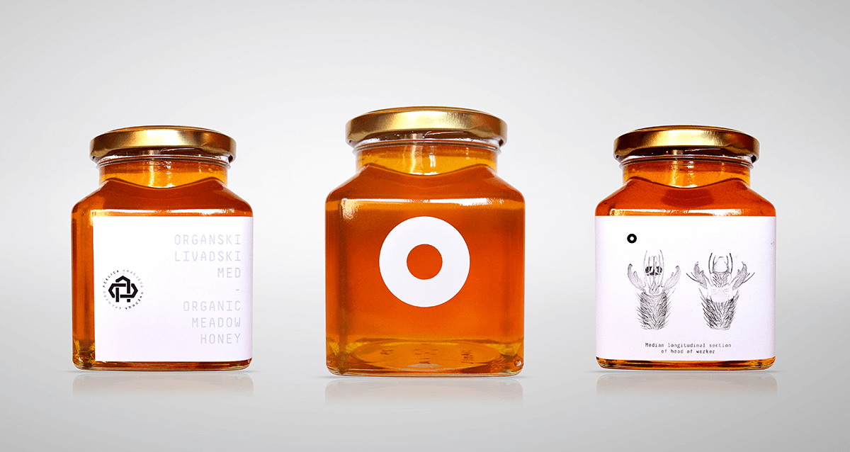
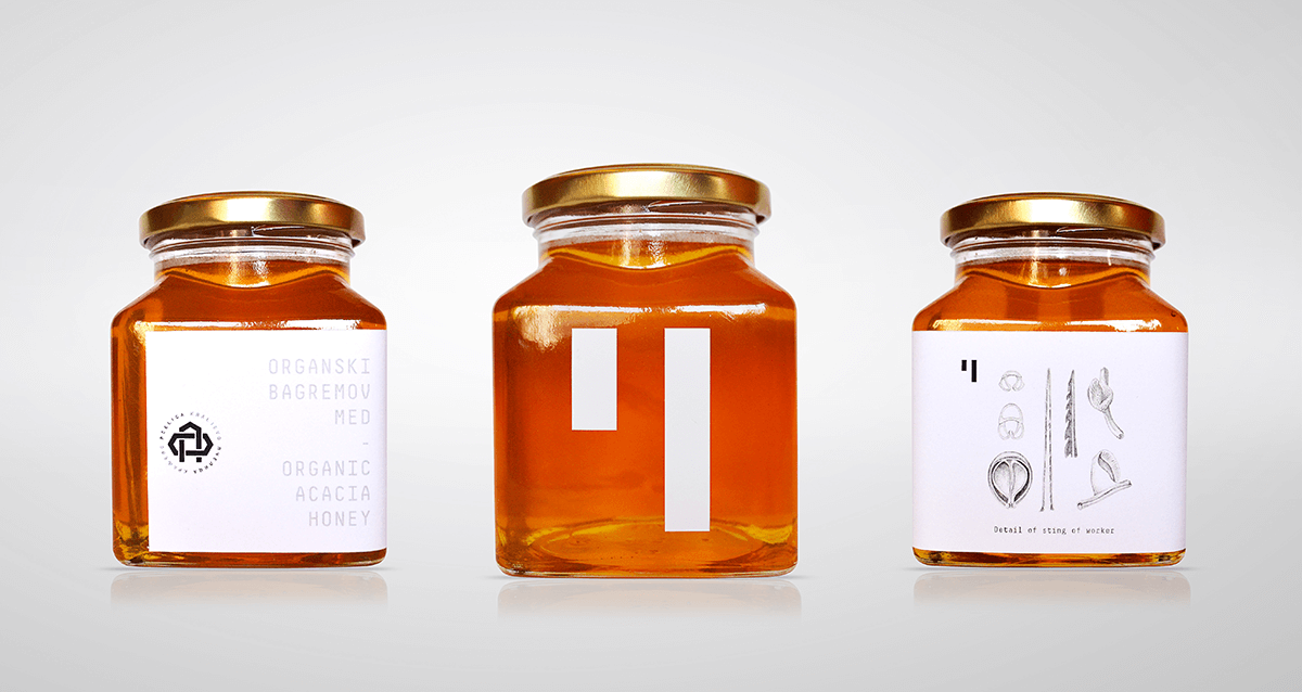
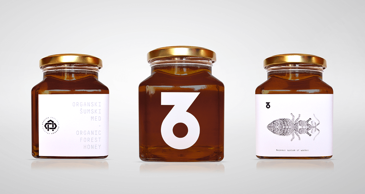
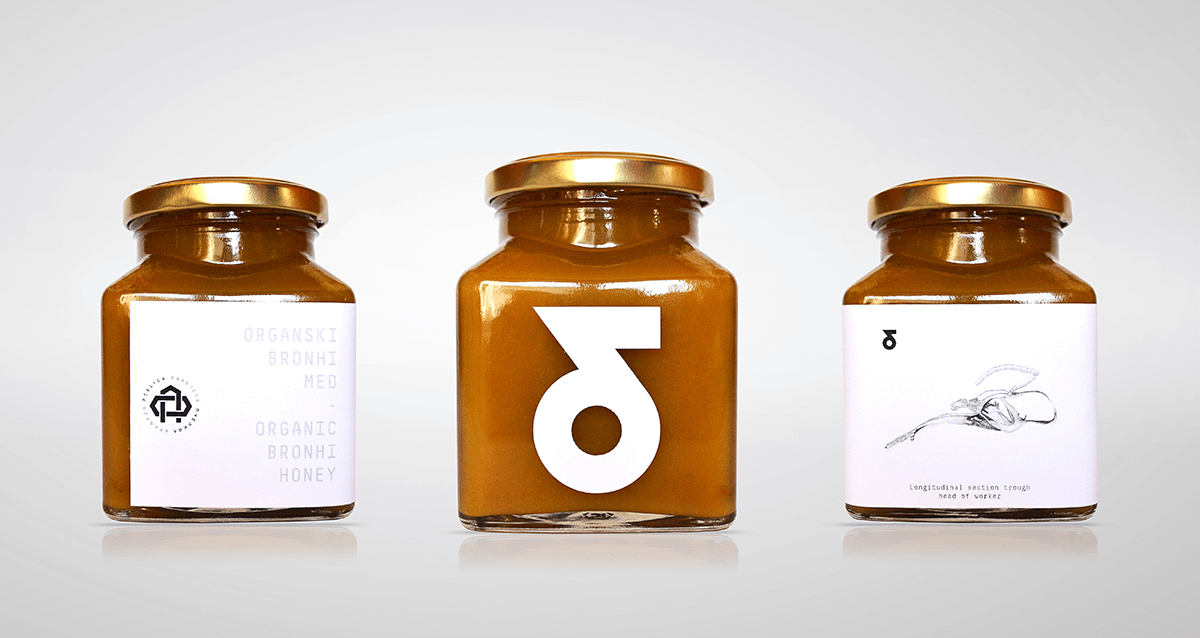
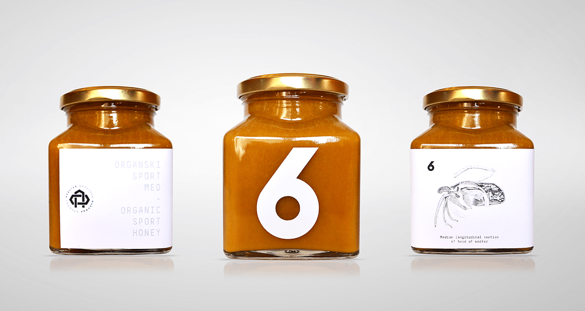
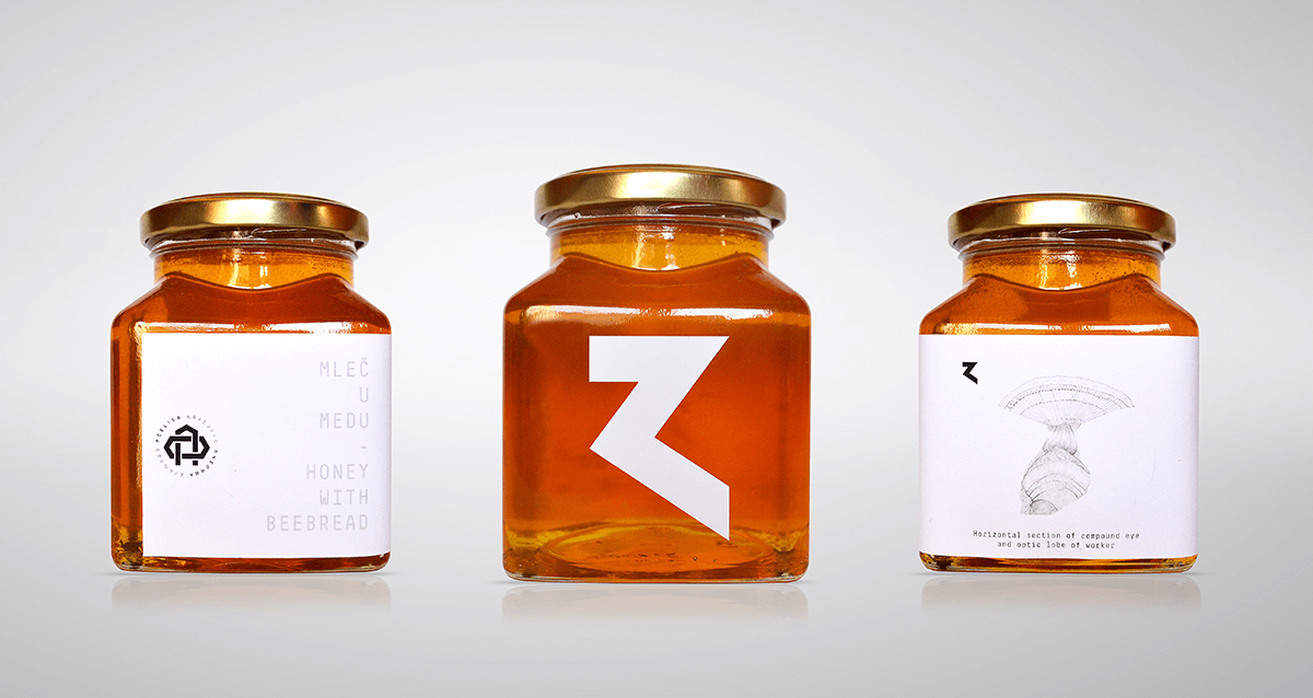
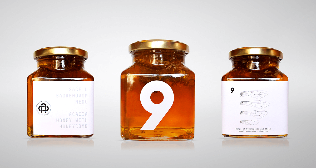
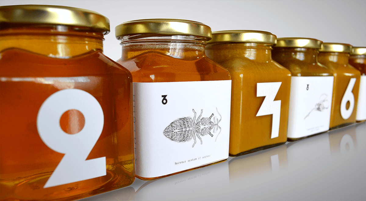
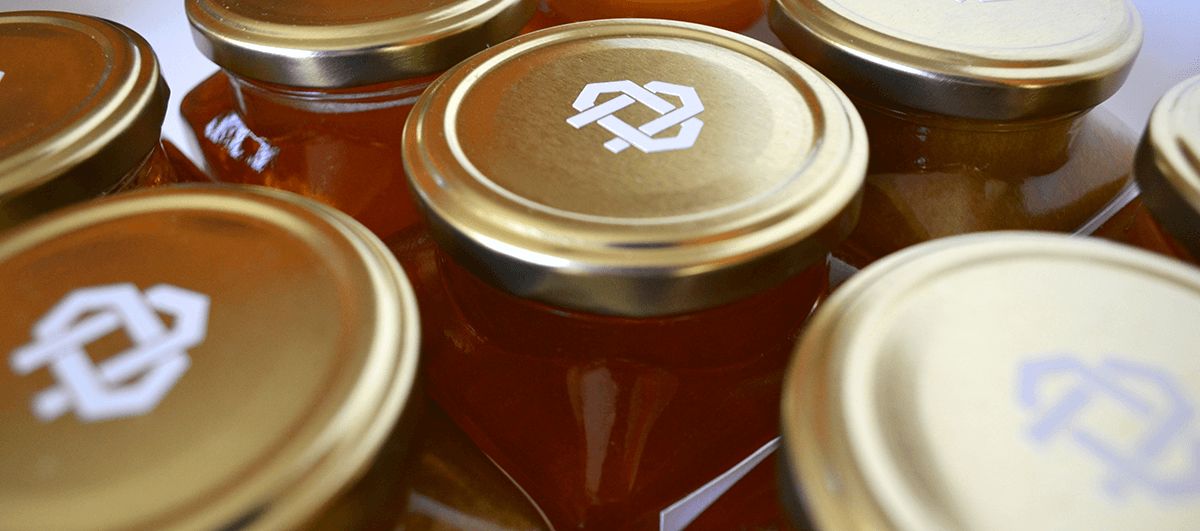
Educating through design is a key element in our packaging concept for Pcelica Honey. We’ve integrated informative hand-drawn illustrations on the labels, detailing everything from bee anatomy to neural networks. These designs serve a dual purpose: not only enhancing marketing appeal but also imparting knowledge to consumers of all ages. Each label features illustrations on the back, turning every jar into a mini educational resource. This concept is further enriched by the unique numbering of each jar, with abstract numbers specially crafted for this project. The logo itself is a fusion of three symbols: a honeycomb, the initial Cyrillic letter ‘П’ of the company, and a stylized flower shape.